Color Theory in Graphic Design

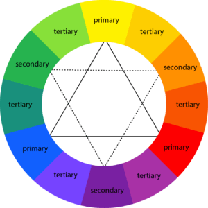
Colors play one of the biggest roles in graphic design. It indicates some sort of sign, message, and emotion. Colors define mood, gesture, and professionalism. Colors impact consumers’ impressions of a brand and whether or not they persuade consumers to consider specific brands or make a purchase. Your colors should be legible and easy on the eyes, especially when working with text. For example – Red color can associate both love and anger. Another example is not to use bright colors when designing products for children as it may affect their eyes. Therefore, to understand the color relation and color contrast we must use the color wheel. Color Wheel consists of 12 colors.

- Primary Color – RED, YELLOW, BLUE. It is also called Parent color as it cannot be formed by any color combination.
- Secondary color –Mix of primary colors such as Red + Yellow = Orange Yellow + Blue = Green Blue + Red = Purple
- Tertiary Color – Mix of neighboring secondary color i.e. Red + Orange = Red-Orange Orange + Yellow = Orange-Yellow Yellow + Green = Yellow-Green Green+ Blue = Green-Blue Blue + Purple = Blue-Purple Purple + Red = Purple-Red
Warm Colors and Cool Colors
Warm Colors – These are, for instance, orange, red, yellow, and combinations of these and similar colors. It is associated with sunlight, sand, fire, energy, and heat.
Cool Colors – These are blue, green, and light purple. Cool colors make you feel calm, relaxed and refreshed. It is associated with water, sky, ice, and snow.
Hue – Saturation – Value
Hue is the other name of the color.
Saturation or Chroma means intensity.
High Saturation results in bright color.
Low Saturation results in black and white mode or desaturation.
Value means the dark and light tone of the color.
Shade – Tint – Tone
Shade = Pure color + Black
Tint = Pure color + White
Tone = Pure color + Grey
Color Rules
Monochrome – Monochromatic color schemes are derived from a single base hue and extended using its shades, tones, and tints.
Complementary – These are found on the opposite end of the color wheel and have high contrast which produces a vibrant exciting color scheme. Ex-Red and Green.
Triadic – It uses three colors that are evenly spaced and produce a vibrant effect. Ex-Red, Blue, Yellow. Therefore, in these three colors, one will act as dominant.
Rectangle (Tetradic) or Double Complementary – Four colors use in two complementary pairs. Mostly used for child toys.
Analogous – 2-4 colors sitting next to each other on the color wheel. Mostly used in food packaging, nature, grass.
Split Complementary – It uses two colors adjacent to its complementary colors.
Square – It uses four colors evenly spaced around the color wheel.
Color Association
RED – Love, Energy, Intensity, Excitement, Strength, Danger, Passion
YELLOW – Joy, Warmth, Attention, Happiness, Creativity, Cheer
GREEN – Nature, Freshness, Healing, Safety, Quality, Growth
BLUE – Trust, Reliability, Coolness, Stability, Peace, Competence
PURPLE – Royalty, Wealth, Luxury, Ambition, Spiritual, Dignity
ORANGE – Success, Bravery, Playfulness, Vibrance, Sociability, Confidence, Warmth
PINK – Sweet, Softness, Security, Nurture, Sophistication, Compassion, Sincerity
BROWN – Dependable, Simple, Rugged, Trustworthy
GOLD – Prestige, Expensive, Elegant
SILVER – Cold, Prestige Scientific
WHITE – Pureness, Clean, Youthful, Simplicity, Honest, Innocent
BLACK – Formality, Dramatic, Security, Elegant, Sophisticated, Mystery
To sum up, colors are the roots of design. Choosing the right color will help you to construct a good design. For instance, if you are designing a poster especially to target the women’s section, then you can do some research on what colors they are generally attracted to. However, that does not include using too many colors in one place. Similarly, avoid using 2-3 bright colors on the same design. In other words, go with subtle and neutral colors. Above all, a better way to learn is to experiment with different colors.
For more information related to colors you can visit here https://www.colormatters.com/
To create a color palette, you can visit here https://color.adobe.com/create/color-wheel or https://coolors.co/
At All We Design, We help you to create your Digital Presence by building your Website. We thrive to make your business excel through modern website layout designing, website creation, and optimized landing pages. All We Design also helps in promoting your business through digital advertising, ad videos, and posters. We specialize in graphic designing, ad banners, and posters designing, services of management and marketing your website (Google ads), and social media (Facebook and Instagram ad promotion).
If you enjoyed this article or have any questions for us, please feel free to leave them in the comment section below!