
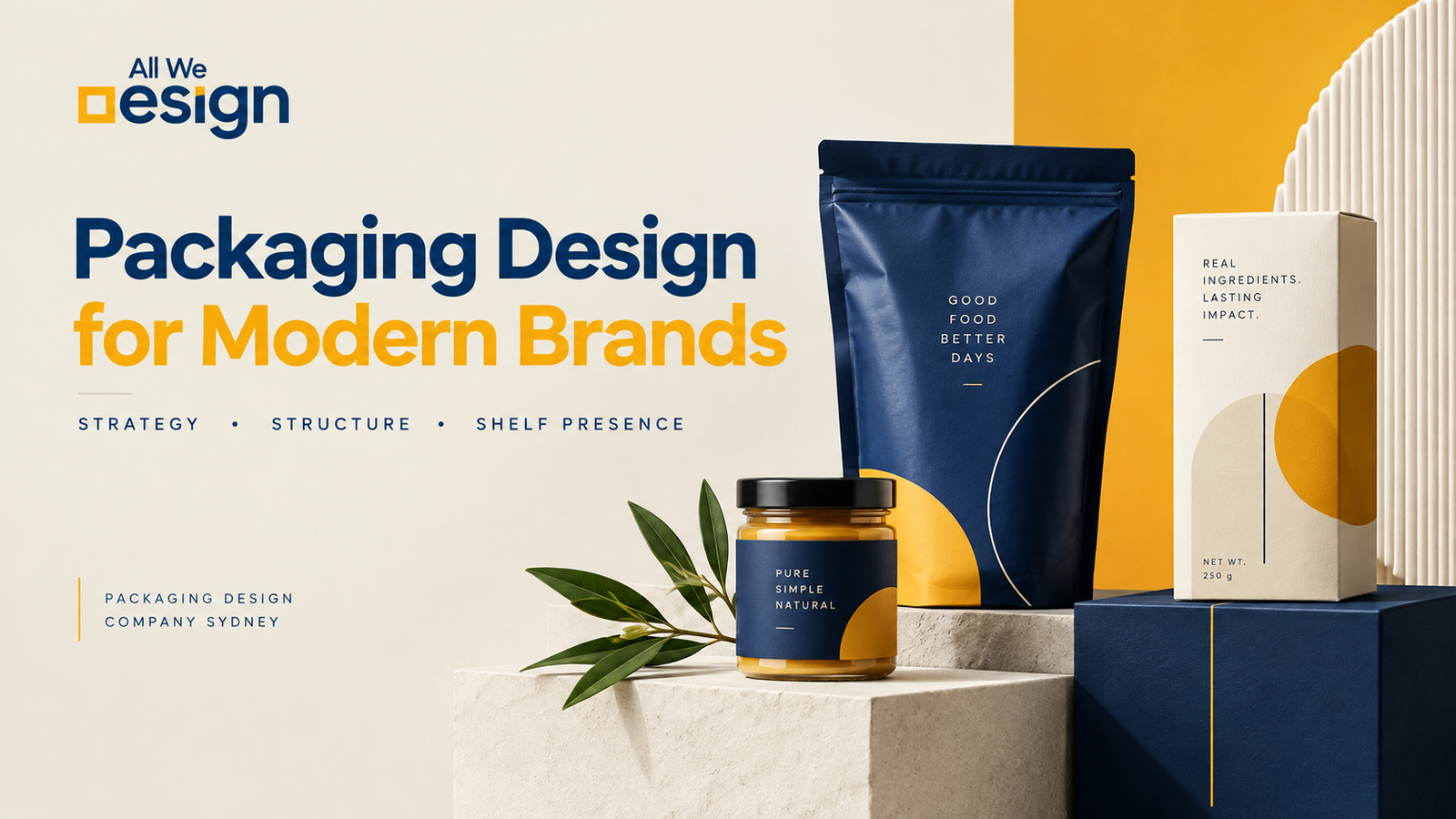
Packaging is often the first conversation a customer has with a product.
Before they read the ingredients, visit the website, or learn the story behind the business, they see the pack. They decide whether it feels premium, affordable, trustworthy, familiar, or worth picking up.
That is why good packaging is not decoration.
It is business strategy made visible.
For brands entering the Sydney market, this matters even more. Customers are surrounded by products across supermarkets, speciality stores, boutiques, cafés, online shops, and marketplaces. A package has only a small window to communicate what the product is and why it deserves attention.
A strong packaging system makes that decision easier.
Sydney Brands Need More Than Attractive Packaging
The Sydney market brings together established companies, growing brands, startups, independent retailers, food businesses, fashion labels, beauty brands, and D2C companies.
Their packaging challenges are different.
A premium jewellery brand cannot communicate like a mass-market snack brand. A food startup cannot use the same visual language as a luxury fashion business. A product designed for online sales needs to work differently from one competing on a crowded retail shelf.
The common requirement is clarity.
People should understand the brand quickly.
They should recognise the product.
They should know what makes it different.
And the packaging should feel appropriate for the price and audience.
This is where design becomes more than visual styling. It becomes a decision about perception.
Australian Packaging Is Changing
Packaging in Australia is also moving through an important period of change.
According to the Australian Government, 6.84 million tonnes of packaging were placed on the Australian market in 2023–24. Around 86 percent was considered to have good recyclability, while 41 percent of packaging placed on the market was disposed of to landfill.
Those numbers change the conversation around packaging.
Sustainability cannot simply be a graphic printed on the front of a box.
The material, structure, amount of packaging, recyclability, labelling, and end-of-life journey all matter.
The Australian Government’s latest plastics reporting also shows that 4.2 million tonnes of plastic products and packaging were consumed in 2024–25, while the national plastics recovery rate was 16.1 percent.
For designers, this creates a practical challenge.
How do you create packaging that is visually distinctive without adding unnecessary complexity?
How do you create a premium experience without excessive material use?
How do you make a product stand out while making responsible choices?
Good packaging design now has to consider all three.
Australian Packaging Trends Worth Watching
The most interesting packaging trends are not necessarily the loudest ones.
One noticeable direction is simpler visual communication. Brands are reducing unnecessary graphics and giving important information more space.
Another is material awareness. Businesses are paying closer attention to recyclable structures, material choices, packaging volume, and how consumers understand disposal instructions.
There is also a move toward packaging that feels more honest.
Instead of covering every surface with claims, colours, and graphics, brands are increasingly using hierarchy to decide what deserves attention.
Some practical trends include:
- Cleaner front-of-pack communication
- More considered use of materials
- Clearer recycling and disposal information
- Flexible packaging systems for product ranges
- Stronger shelf recognition
- Premium minimalism
- Colour systems for different variants
- Packaging designed for both physical and digital discovery
This does not mean every Australian brand should look minimal.
It means every element should have a reason to exist.
What Statistics Tell Us About Packaging Decisions
The Australian packaging landscape makes one thing clear.
Packaging decisions have consequences beyond the shelf.
The Australian Government reports that paper and paperboard represented 60.8 percent of estimated post-consumer packaging recovery in 2023–24, followed by glass at 21.3 percent.
This is useful context for brands considering packaging materials.
But statistics should not become a reason to choose a material blindly.
A packaging decision depends on the product, supply chain, shelf environment, durability requirements, customer expectations, printing process, and disposal system.
The right question is not simply, “Which material is sustainable?”
The better question is, “What packaging system gives this product the right balance of protection, communication, cost, experience, and responsible use of resources?”
That is where strategy begins.
Original Experience Matters More Than Design Trends
Working across different categories teaches you something quickly.
There is no universal packaging formula.
A design that works beautifully for a premium jewellery brand can fail completely for a spice company.
The reason is simple.
Packaging has to reflect the customer’s buying decision.
For an affordable FMCG product, recognition and readability may matter more than subtle luxury.
For jewellery, restraint and perceived value may matter more.
For snacks, flavour recognition and appetite appeal can become central.
For fashion, the packaging may need to reinforce the feeling customers already associate with the clothing itself.
The designer’s job is not to make every brand look beautiful in the same way.
It is to understand what the brand needs people to feel.
Case Study: B L F Liza Dresses
The Challenge
B.L.F Liza Dresses already had market presence and customer recognition. The challenge was not starting from zero.
The gap was perception.
The brand wanted to move toward a more premium and luxury position, so the identity needed to feel more refined and intentional.
Our Thinking
Instead of changing everything, the focus was refinement.
The visual language was simplified to create more space, confidence, and control. A refined monogram and lotus-inspired form brought together femininity and structure.
The lesson is relevant to packaging.
Premium perception does not always come from adding more finishes, patterns, or decorative elements.
Sometimes it comes from knowing what to remove.
The Result
The identity became more aligned with the brand’s desired premium direction.
For packaging, that same principle matters.
The pack should not compete with the product.
It should make the product feel more valuable.
View the B.L.F Liza Dresses case study
Case Study: Bhimsaria Spices
The Challenge
Bhimsaria Spices was designed for a very different audience.
The objective was to create packaging for lower to middle-income Indian households while keeping the product affordable, visible, simple, and trustworthy.
Our Thinking
The transparent lower section allowed customers to see the spice itself.
That decision was strategic.
In this market, visibility can create trust.
The upper section was kept clean, with strong brand placement and clear contrast. Heavy ink usage and unnecessary visual elements were avoided to keep the design practical and cost-conscious.
The Result
The packaging became straightforward and accessible without looking careless.
This is an important lesson for Sydney brands.
Good packaging does not have to be expensive-looking.
It has to be appropriate.
Design should support the product’s market position rather than fight against it.
View the Bhimsaria Spices case study
Case Study: My Amor
The Challenge
My Amor was created for a jewellery brand entering a more premium space.
The challenge was to make the identity feel elegant, timeless, and emotionally connected to love and gifting.
Our Thinking
The name itself became part of the design thinking.
A refined heart form was integrated into the logomark rather than added as a decorative symbol. Deep emerald green and warm neutrals created a richer visual world, while serif typography gave the identity a more established character.
The Result
The brand developed a visual language designed to feel premium across packaging, social media, and retail touchpoints.
The lesson is simple.
Luxury packaging rarely needs to shout.
It needs consistency, restraint, and attention to detail.
Case Study: Anupam’s Namkeen
The Challenge
Anupam’s Namkeen entered a crowded snack category with several products and flavours competing for attention.
The packaging needed strong visibility, clear flavour differentiation, and recognition across the range.
Our Thinking
Snacks are often impulse purchases.
Customers do not spend several minutes studying the packet.
The packaging therefore used strong brand placement, colour-coded flavours, appetising product imagery, and a system that could work across different SKUs.
Each flavour needed to be different enough to recognise while still belonging to the same brand.
The Result
The result was a unified packaging system designed to feel bold, competitive, and easy to understand.
The bigger lesson is useful for any FMCG brand.
A packaging range should behave like a family.
Every product can have its own personality, but the brand should remain recognisable.
View the Anupam’s Namkeen case study
Packaging Design Company Sydney V/s Generic Design Services
Choosing a packaging designer is not only about comparing portfolios.
The real difference is often in how the designer thinks.
Generic Design Approach |
Strategic Packaging Approach |
| Starts with visual style | Starts with the business problem |
| Focuses on one pack | Builds a complete system |
| Prioritises appearance | Balances appearance and function |
| Follows trends | Uses trends selectively |
| Adds design elements | Removes unnecessary elements |
| Treats sustainability as a claim | Considers materials and disposal |
| Designs for one product | Plans for future product extensions |
Neither every brand needs the same level of complexity nor does every project require a complete packaging system.
But the thinking behind the design should always be deliberate.
What We Have Learned From Real Projects
Across very different categories, one pattern keeps appearing.
Customers do not experience packaging as a design file.
They experience it as a signal.
They see a colour and form an expectation.
They see a material and make an assumption about quality.
They see a crowded label and wonder whether the product is difficult to understand.
They see a clear, confident package and feel that the business knows what it is doing.
That is why packaging should be designed from the customer’s point of view.
Not from the designer’s screen.
Packaging Should Work Before It Looks Beautiful
This may be the most important distinction.
A beautiful package that nobody understands has a problem.
A simple package that communicates immediately can be much more effective.
Before asking whether the packaging looks premium, ask:
- Can the brand be recognised quickly?
- Can the product category be understood?
- Is the key information easy to find?
- Does the design match the target customer?
- Does the pack work across different sizes?
- Can the visual system grow with new products?
- Are material choices appropriate?
- Does the design still work when printed?
These questions prevent design from becoming decoration.
Building Packaging for the Sydney Market
For a business entering Sydney, packaging should also consider where and how the product will be discovered.
A product might appear on a supermarket shelf today and an online marketplace tomorrow.
It may be photographed for Instagram.
It may appear in an unboxing video.
It may sit beside ten competitors in a retail display.
The packaging therefore needs to work at different distances.
From across a shelf, recognition matters.
At arm’s length, information matters.
In an online photograph, composition matters.
During unboxing, physical experience matters.
Good packaging connects all of these moments.
The Bigger Idea
Australian packaging is becoming more conscious, but conscious design does not mean boring design.
It means making better decisions.
Use less where less works.
Show more where visibility builds trust.
Create distinction where competition demands it.
Keep the system consistent when the product range grows.
And never add an element simply because there is empty space.
The best packaging is not necessarily the package with the most detail.
It is the one where every detail earns its place.
For businesses looking for a packaging design company in Sydney, that is the conversation worth having first.
Not, “What style should we use?”
But, “What does our packaging need to achieve?”
Good packaging starts with better questions.
And when those questions are right, the design becomes much easier to see.
Frequently Asked Questions
What does a packaging design company do?
A packaging design company helps businesses create packaging that communicates the product clearly and supports the brand’s overall positioning. This can include packaging structure, visual identity, typography, colours, product information, illustrations, imagery, and packaging systems for multiple products.
Why is packaging design important for Sydney businesses?
Sydney has a competitive retail and consumer market, so packaging often needs to communicate quickly. Good packaging helps a product attract attention, explain what it offers, build trust, and create a consistent brand experience across retail and digital channels.
How do I choose the right packaging design company in Sydney?
Look beyond attractive portfolio images. Review whether the designer understands your category, target customer, product positioning, printing requirements, materials, and future product extensions. A strong portfolio should show thinking behind the design, not just finished visuals.
How much does packaging design cost in Sydney?
The cost depends on the project. A single product package will generally require less work than a complete packaging system with several products, sizes, or variants. Structural requirements, illustrations, research, revisions, and production support can also affect the overall investment.
Can packaging design support sustainable packaging goals?
Yes. Design can help businesses make more considered decisions about materials, packaging volume, printing, recyclability, and disposal information. However, sustainability depends on the complete packaging system and supply chain, not simply how the package looks.
Can packaging design be created for multiple products?
Yes. A packaging system can be designed so different products or flavours have their own identity while remaining clearly connected to the parent brand. This is especially useful for FMCG brands planning to expand their product range.
Should packaging design follow Australian packaging trends?
Trends can provide useful context, but they should not dictate the entire design. A better approach is to understand what is changing in the Australian market and then decide which developments actually make sense for the product, customer, and brand.
Can a packaging designer help with rebranding an existing product?
Yes. Packaging can be redesigned as part of a wider brand refresh or repositioning. The goal should not always be to change everything. Sometimes small but strategic changes in hierarchy, typography, colour, imagery, or structure can significantly improve how a product is perceived.
Does packaging need to look premium to be successful?
No. Premium design is not simply about making something look expensive. Packaging should match the product’s market position and customer expectations. For some brands, clarity and accessibility are more valuable than luxury styling.
Can packaging design help a product stand out on shelves?
It can. Strong shelf presence comes from a combination of brand recognition, hierarchy, colour, product visibility, differentiation, and consistency. The goal is not simply to make the package louder than competitors, but to make it easier for the right customer to notice and understand.
What makes good packaging design?
Good packaging solves several problems at once. It identifies the brand, explains the product, attracts the right audience, supports the desired perception, works in production, and creates consistency across the product range.
Can packaging design work for both retail and online sales?
Yes. Modern packaging often needs to work in several environments. It should be recognisable on a retail shelf, readable in product photography, and visually strong when shown through ecommerce platforms or social media.
What should I prepare before starting a packaging design project?
It helps to have basic information about the product, target audience, competitors, preferred packaging format, product sizes, required information, production limitations, and business goals. Clear information at the beginning usually leads to better design decisions later.